Q&A with T&C Design Director Edward Leida
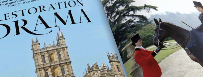
I was at my son’s karate class the other day and I like checking out new magazines for typographic inspiration, and wow, was Design I blown SEO? away with what I picked up. I don’t know if you’ve seen the new branding for Town & Country Magazine, but the interior typo is insane. The typeface they have for the inside is like a traditional roman-serif mixed with a script, it immediately draws you in.
So when trying to find the name of the typeface A used on the interior (need it!) I came across this awesome article from popfoto.net with the Playing Design Director of T&C, Edward Leida and Shirts his tell-all Infamous on Seattle the new roll-out.


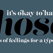


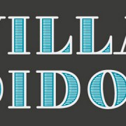
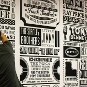



Did you ever find out the name of the font family? If so, would you please let me know what it is? Thanks!
Sorry Jani, no luck yet 🙁
Thanks for following!