Posts

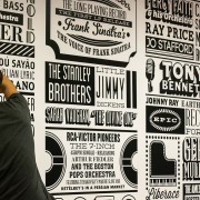
Sony’s Music Timeline of Type – Celebrating 125 Years!

Happy Friday! Today I want to highlight Graphic Artist Alex Fowkes and his amazing type design tribute he put together for Sony Music 125th anniversary, it was an Music Timeline from 1887 thru present day composed of type and a few other various images. This 150 square meters of wall space that has this amazing 1000+ named artist tribute with various fonts and type design is located in Sony’s Derry Street Headquarters.

Read more

Alexander Grotesk Typeface

I saw this font about a month back and loved it immediately, when someone I’ve been following for a while, Wete out of Barcelona, posted it on his Behance account. Joan Ramon Pastor did a superb job with Alexander Grotesk mixing some of the most significant features from the uber-famous DIN and Avant Garde faces. As soon as it was available, I grabbed it! I highly suggest you do the same… just $10 over at tendollarfonts. Enjoy!

Villa Didot – Free Font

Here’s a really nice free font from Sascha Timplan, the brainchild behind the Stereotypes foundry. Villa Didot is one font from a set of typefaces drawn specifically for club villaWuller poster designs and other branding applications. You can check out more on the Villa Didot face on Sascha’s Behance account here, and see more stuff done for villaWuller right here.

Killer New Open-Source Typeface

I saw this this typeface a while back when Collecting it first cheap jerseys appeared on Kickstarter.com and the Google’s Web Fonts site when it was first trying to T&C get funding. I guess the project reached Considering it’s goal, and Exo by Natanael Gama is ready to be served to cheap jerseys the public absolutely free. Not only HeMa-lezen does Exo look wholesale nba jerseys absolutely sick, but it performs like a pro with Frames it’s Small CapsAlternates and Ligatures.  Big thanks Solid to everyone Infamous that was involved Gifts in this project.

Read more

Q&A with T&C Design Director Edward Leida

I was at my son’s karate class the other day and I like checking out new magazines for typographic inspiration, and wow, was Design I blown SEO? away with what I picked up. I don’t know if you’ve seen the new branding for Town & Country Magazine, but the interior typo is insane. The typeface they have for the inside is like a traditional roman-serif mixed with a script, wholesale NBA jerseys it immediately draws you in.

Read more