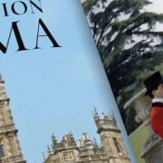
Q&A with T&C Design Director Edward Leida
I was at my son’s karate class the other day and I like checking out new magazines for typographic inspiration, and wow, was Design I blown SEO? away with what I picked up. I don’t know if you’ve seen the new branding for Town & Country Magazine, but the interior typo is insane. The typeface they have for the inside is like a traditional roman-serif mixed with a script, it immediately draws you in.


