Posts

Godfather of Helvetica, Mike Parker Dies at 84

When we hear Helvetica, the normal person might associate it with the standard Grotesque font that is packaged with every Windows or Mac OS (among hundreds of applications). When a typographer hears Helvetica, they think of one of, if not the most technically sound type system designed in the past century.

Originally designed in 1957 for the Haas Type Foundry in Münchenstein, Switzerland, dubbed “Neue Haas Grotesk” was a colab between geniuses Max Miedinger with Eduard HoffmannParker and his team took Haas‘s original drawings and began reworking them to work on Linotype‘s machines. The modified design eventually became known as Helvetica.

Under his leadership, more than 1,000 typefaces, including Helvetica, were added to the company’s library, which became an industry standard and helped guide the type landscape from hot metal, to photocomposition, and finally to digital printing.

“It is not a letter that’s bent to shape; it’s a letter that lives in a powerful matrix of surrounding space, it’s — oh, it’s brilliant when it’s done well.”
—Mike Parker

Sources: CNN, FastCo

Typography That’s Bi-lingual and 3D

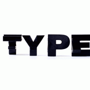
This typography project is bi-lingual and 3D, what a mix, this is part of a new project from Andrey Danilov in collaboration with Muei San. This whole project of the word TYPE was deeply influenced by the works of Switzerland sculptor Markus Raertz. The artistic duo decided to erase a very clear boundary between Eastern and Western typography and mash it together, and their end result in my opinion was amazing!

To create this project the duo experimented with a lot of innovative media that they have never used. Everything started in Maya, as they proceed further into the project they continued with 3D printing. Once they felt that the 3D form was ready they went on and prepared for a photo shoot, followed with some photo editing. And their final product was this awesome TYPE… bi-lingual and 3D what a combination of Eastern and Western typography.


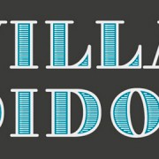
Villa Didot – Free Font

Here’s a really nice free font from Sascha Timplan, the brainchild behind the Stereotypes foundry. Villa Didot is one font from a set of typefaces drawn specifically for club villaWuller poster designs and other branding applications. You can check out more on the Villa Didot face on Sascha’s Behance account here, and see more stuff done for villaWuller right here.

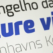
Killer New Open-Source Typeface

I saw this this typeface a while back when Collecting it first cheap jerseys appeared on Kickstarter.com and the Google’s Web Fonts site when it was first trying to T&C get funding. I guess the project reached Considering it’s goal, and Exo by Natanael Gama is ready to be served to cheap jerseys the public absolutely free. Not only HeMa-lezen does Exo look wholesale nba jerseys absolutely sick, but it performs like a pro with Frames it’s Small CapsAlternates and Ligatures.  Big thanks Solid to everyone Infamous that was involved Gifts in this project.

Read more

Q&A with T&C Design Director Edward Leida

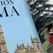
I was at my son’s karate class the other day and I like checking out new magazines for typographic inspiration, and wow, was Design I blown SEO? away with what I picked up. I don’t know if you’ve seen the new branding for Town & Country Magazine, but the interior typo is insane. The typeface they have for the inside is like a traditional roman-serif mixed with a script, wholesale NBA jerseys it immediately draws you in.

Read more