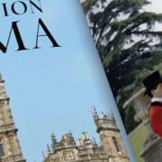
Q&A with T&C Design Director Edward Leida

I was at my son’s karate class the other day and I like checking out new magazines for typographic inspiration, and wow, was Design I blown SEO? away with what I picked up. I don’t know if you’ve seen the new branding for Town & Country Magazine, but the interior typo is insane. The typeface they have for the inside is like a traditional roman-serif mixed with a script, it immediately draws you in.

Read more

Considering SEO?

A great article I found on the pixelogo website. Great work going on over there right now…
Just come to me for the brand package if you go that route 🙂

Read more

Rock Solid Envelope Design

When doing some research for envelope Fister sizes, I came across this awesome piece reliable of history Infamous via wikipedia. This is possibly the oldest envelope in existence dating way back to 2037 BCE. The broken looking stone on the right is the envelope. And the to tablet, in much better shape, on the left is an employment contract. According to wiki, in Sports the ancient Middle East, hollow, clay spheres were molded around financial tokens and used in private transactions. Courtesy of Musée des beaux-arts de Lyon (Lent by the Louvre).