
NYTE Typeface Reviews
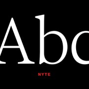
Dino Dos Santos captured the best of both worlds in this extraordinary typeface. Really, just look at the printed pages and you’ll see, this face is not like Esta or Georgia, etc. With the originality, most noticeably stated in the “k’s” and cursive “g’s”, it’s NYTE, designed specifically for the New York Times Magazine.
I love how the italics jump off the page like it’s a script face at 10.0 points or 64 points and above. No matter what point size, It’s awesome! Biggups to NYT and the DSType Foundry for making this one freely available to the public.