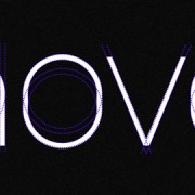
NYTE Typeface Reviews

Dino Dos Santos captured the best of both worlds in this extraordinary typeface. Really, just look at the printed pages and you’ll see, this face is not like Esta or Georgia, etc. With the originality, most noticeably stated in the “k’s” and cursive “g’s”, it’s NYTE, designed specifically for the New York Times Magazine.

I love how the italics jump off the page like it’s a script face at 10.0 points or 64 points and above. No matter what point size, It’s awesome! Biggups to NYT and the DSType Foundry for making this one freely available to the public.

New Latinotype Typefaces

One of my favorite foundries at the moment, pushing out awesome designs, Latinotype is a new digital type foundry established in the year 2007 in the city of Concepción, Chile. Their goal is to design new typefaces remixing diverse influences related to our South American identity (most often known as “latino”) with high quality products for the contemporary design industry.

Check out the types here.

Inside Look: Saul Bass

I ran across this awesome article on 99designs and thought they really did an awesome job, so I had to share it with you… If you don’t know who Saul Bass was, he was a legendary designer who’s designed some of the most timeless designs for some of the largest brands ever. Think ATTGirl ScoutsKeeenex, and the list goes on….

Read more

Alexander Grotesk Typeface

I saw this font about a month back and loved it immediately, when someone I’ve been following for a while, Wete out of Barcelona, posted it on his Behance account. Joan Ramon Pastor did a superb job with Alexander Grotesk mixing some of the most significant features from the uber-famous DIN and Avant Garde faces. As soon as it was available, I grabbed it! I highly suggest you do the same… just $10 over at tendollarfonts. Enjoy!